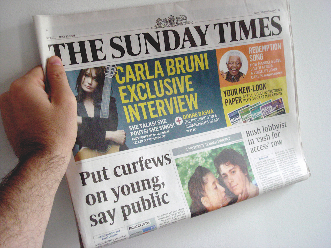
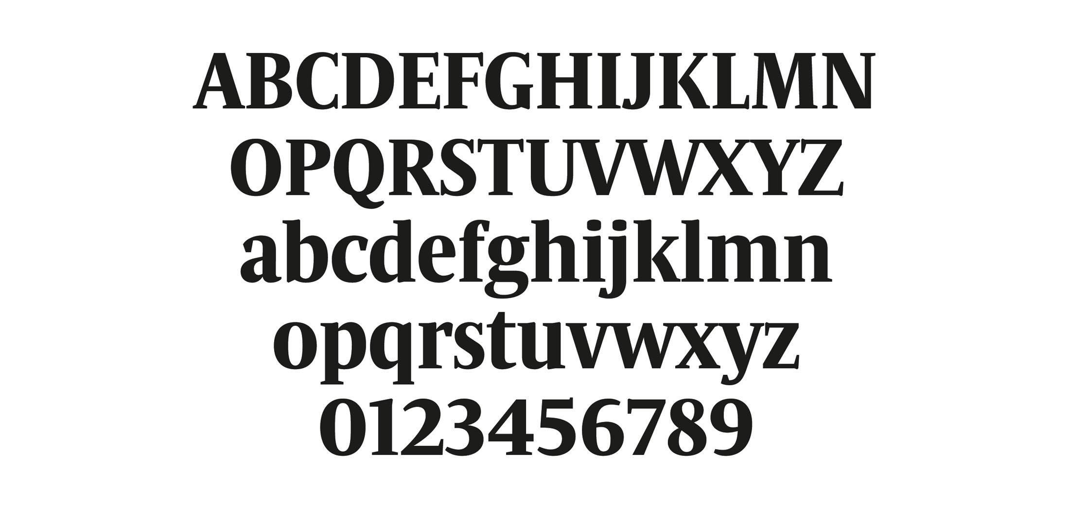
Commissioned by Art director Alfredo Triviño for "The
Sunday Times".
The first sketches of the “Sunday Times Modern” were done at the beginning
of November 2007. One started by working with a more classic idea, the first
drawings were much softer and a in certain way conventional (drop form terminals,
"normal" proportions and certain baroque details like the ear of the "g").
But immediately after an effective observation of the competition it was
decided to give a volte face in the formal finish of the characters, changing
the serifs, terminals and many other details, among the width of the characters.
The change was not only motivated by a need to differ from the competence,
there were much more ideas they needed to transmit. It had to be more aggressive
and show much more energy, but still being elegant; denote tradition and
be contemporary at the same time, it was a whole challenge to communicate
so many concepts; fortunately the typography is a complex signs system which
allows many shades. The alphabet consists of letters and these are formed
on parts (serifs, stems, arches, terminals, etc.), so that we have many
elements to combine and to transmit a unique identity.
The result of this approach was a sharper, more energetic and more masculine
typeface, serifs without brackets and terminals in polygonal shapes, keeping
the elegance thanks to the pronounced contrast and the smoothness of the
curves. The "Sunday Times Modern" possesses a strong personality, attempting
to avoid any reference to other typefaces, emphasizing in the originality,
but avoiding falling down in eccentricities that hamper the pace of reading.
It possesses multiple details, most of them only visible in big sizes. Different
shapes that change between the round and the italic, contrast among soft
curves and hard serifs. In general a lot of variety and many surprises to
achieve an innovate typeface. Being a semi condensate typography it allows
to insert more characters per line, it was one of the requirements of the
"briefing" and the great challenge was to achieve a not excessively compressed
typeface in the visual aspect, but thanks to the open forms of some letters
(like the a, c, r, s,…) the condensed effect was minimized.
The "Sunday Times Modern" is being used to compose the headlines
in the main section of the newspaper, while the rest of the sections
are being used as secondary typeface.
It is a display typeface, and, in the beginning is optimized to work in headlines
between 50 and 90pt, though is possible to use it safely starting from a
body of 16. The "x" height is 81% of the height of the
capital letters, which makes it be seen as bigger in compared with many
others typefaces. In addition it has ascendant and descendant shorts, which
allows it to use close leading. As a consequence one can compose
more compact headlines with a high visual impact.
This type family consists of 6 styles: Light, Light Italic, Medium, Medium
Italic, Bold and Bold Italic. It is of exclusive use of “The Sunday Times”
newspaper and is not available to license. After several months of work it
was finished in June, 2008 and is already possible to see in functioning
in the brand new redesign of the newspaper created by talented Alfredo Triviño.
Eduardo Manso, July 2008
«The Sunday Times Modern typefaces were created by Emtype Foundry
for The Sunday Times newspaper in London. © Times Newspapers Limited
2008».
More info
The
Sunday Times Online
The
Sunday Times redesign, by Mario García
More
about Sunday Times redesign, by cuatrotipos.com
Select
in 'Tipos Latinos 2010'.