


Loading Fonts
Relato Sans is the other face of Relato Serif, being the sans more austere and aseptic. A humanistic type, with a contemporary cut, created for general use in texts and with a great variety of weights, which allow enough flexibility for demanding projects. It maintains many of the characteristics of its homologous such as proportions, the x height, the construction based on air lines of the italic, ornaments and so on. These details show coherence with the serif version, and at the same time reinforce its personality.
- 12 Fonts
- Free trials
- Buy packages
Relato Sans Roman Pack
6 Fonts
Light Regular Medium SemiBold Bold Black
Relato Sans Italic Pack
6 Fonts
Light Italic Regular Italic Medium Italic SemiBold Italic Bold Italic Black Italic
Relato Sans
Light
- Relato Sans Light
- Relato Sans Light Italic
- Relato Sans Regular
- Relato Sans Regular Italic
- Relato Sans Medium
- Relato Sans Medium Italic
- Relato Sans SemiBold
- Relato Sans SemiBold Italic
- Relato Sans Bold
- Relato Sans Bold Italic
- Relato Sans Black
- Relato Sans Black Italic
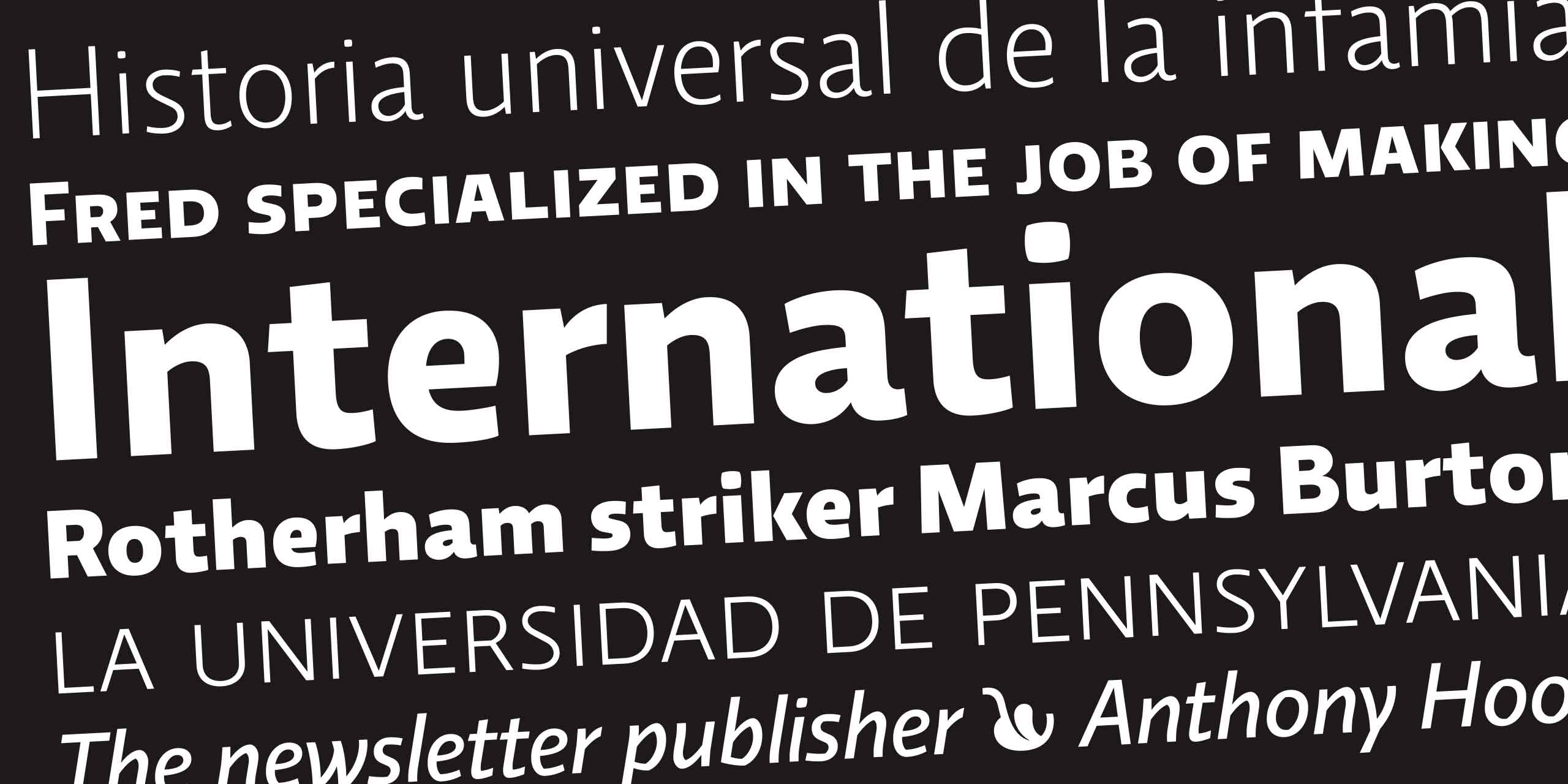
Rotherham
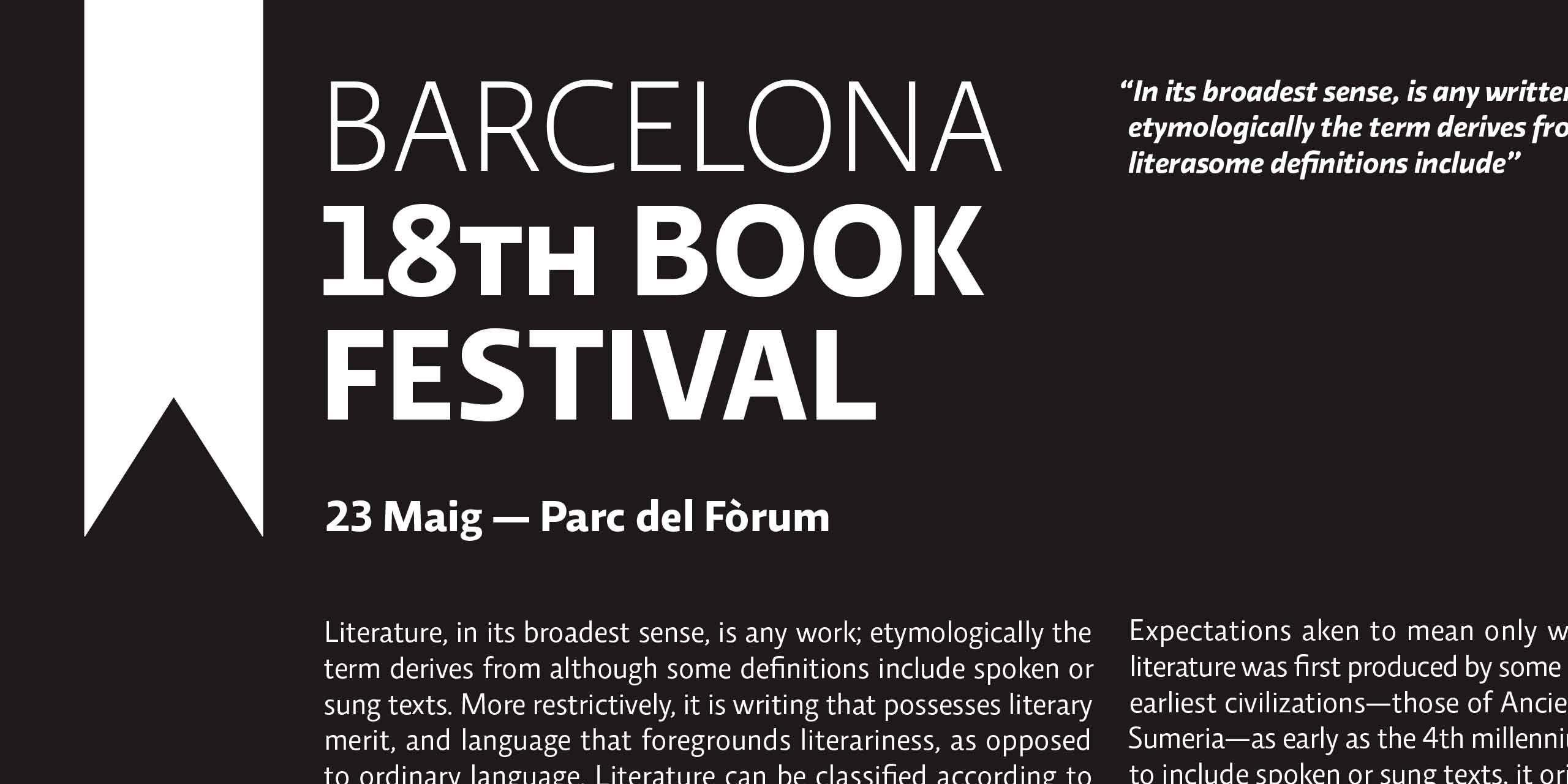
In a badly designed book, the letters mill and stand like starving horses in a field. In a book designed by rote, they sit like stale bread and mutton on the page. In a well-made book, where designer, compositor and printer have all done their jobs, no matter how many thousands of lines and pages, the letters are alive. They dance in their seats. Sometimes they rise and dance in the margins and aisles. — Robert Bringhurst, The Elements of Typographic Style.
Relato Sans
Light Italic
- Relato Sans Light
- Relato Sans Light Italic
- Relato Sans Regular
- Relato Sans Regular Italic
- Relato Sans Medium
- Relato Sans Medium Italic
- Relato Sans SemiBold
- Relato Sans SemiBold Italic
- Relato Sans Bold
- Relato Sans Bold Italic
- Relato Sans Black
- Relato Sans Black Italic
The newsletter
In a badly designed book, the letters mill and stand like starving horses in a field. In a book designed by rote, they sit like stale bread and mutton on the page. In a well-made book, where designer, compositor and printer have all done their jobs, no matter how many thousands of lines and pages, the letters are alive. They dance in their seats. Sometimes they rise and dance in the margins and aisles. — Robert Bringhurst, The Elements of Typographic Style.
Relato Sans
Regular
- Relato Sans Light
- Relato Sans Light Italic
- Relato Sans Regular
- Relato Sans Regular Italic
- Relato Sans Medium
- Relato Sans Medium Italic
- Relato Sans SemiBold
- Relato Sans SemiBold Italic
- Relato Sans Bold
- Relato Sans Bold Italic
- Relato Sans Black
- Relato Sans Black Italic
Universal
In a badly designed book, the letters mill and stand like starving horses in a field. In a book designed by rote, they sit like stale bread and mutton on the page. In a well-made book, where designer, compositor and printer have all done their jobs, no matter how many thousands of lines and pages, the letters are alive. They dance in their seats. Sometimes they rise and dance in the margins and aisles. — Robert Bringhurst, The Elements of Typographic Style.
Relato Sans
Regular Italic
- Relato Sans Light
- Relato Sans Light Italic
- Relato Sans Regular
- Relato Sans Regular Italic
- Relato Sans Medium
- Relato Sans Medium Italic
- Relato Sans SemiBold
- Relato Sans SemiBold Italic
- Relato Sans Bold
- Relato Sans Bold Italic
- Relato Sans Black
- Relato Sans Black Italic
Pennsylvania
In a badly designed book, the letters mill and stand like starving horses in a field. In a book designed by rote, they sit like stale bread and mutton on the page. In a well-made book, where designer, compositor and printer have all done their jobs, no matter how many thousands of lines and pages, the letters are alive. They dance in their seats. Sometimes they rise and dance in the margins and aisles. — Robert Bringhurst, The Elements of Typographic Style.
Relato Sans
Medium
- Relato Sans Light
- Relato Sans Light Italic
- Relato Sans Regular
- Relato Sans Regular Italic
- Relato Sans Medium
- Relato Sans Medium Italic
- Relato Sans SemiBold
- Relato Sans SemiBold Italic
- Relato Sans Bold
- Relato Sans Bold Italic
- Relato Sans Black
- Relato Sans Black Italic
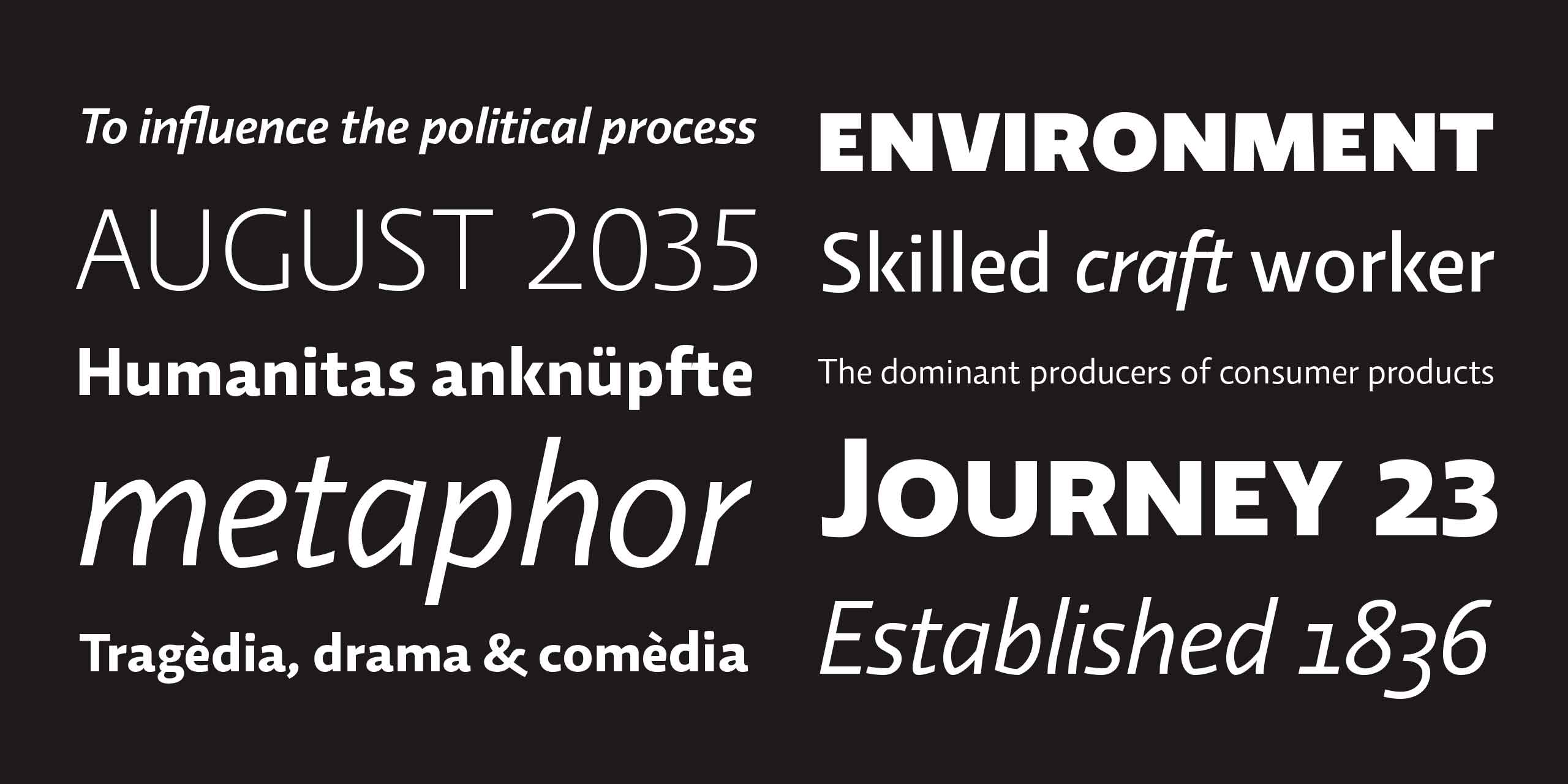
Environment
In a badly designed book, the letters mill and stand like starving horses in a field. In a book designed by rote, they sit like stale bread and mutton on the page. In a well-made book, where designer, compositor and printer have all done their jobs, no matter how many thousands of lines and pages, the letters are alive. They dance in their seats. Sometimes they rise and dance in the margins and aisles. — Robert Bringhurst, The Elements of Typographic Style.
Relato Sans
Medium Italic
- Relato Sans Light
- Relato Sans Light Italic
- Relato Sans Regular
- Relato Sans Regular Italic
- Relato Sans Medium
- Relato Sans Medium Italic
- Relato Sans SemiBold
- Relato Sans SemiBold Italic
- Relato Sans Bold
- Relato Sans Bold Italic
- Relato Sans Black
- Relato Sans Black Italic
Political process
In a badly designed book, the letters mill and stand like starving horses in a field. In a book designed by rote, they sit like stale bread and mutton on the page. In a well-made book, where designer, compositor and printer have all done their jobs, no matter how many thousands of lines and pages, the letters are alive. They dance in their seats. Sometimes they rise and dance in the margins and aisles. — Robert Bringhurst, The Elements of Typographic Style.
Relato Sans
SemiBold
- Relato Sans Light
- Relato Sans Light Italic
- Relato Sans Regular
- Relato Sans Regular Italic
- Relato Sans Medium
- Relato Sans Medium Italic
- Relato Sans SemiBold
- Relato Sans SemiBold Italic
- Relato Sans Bold
- Relato Sans Bold Italic
- Relato Sans Black
- Relato Sans Black Italic
Craft worker
In a badly designed book, the letters mill and stand like starving horses in a field. In a book designed by rote, they sit like stale bread and mutton on the page. In a well-made book, where designer, compositor and printer have all done their jobs, no matter how many thousands of lines and pages, the letters are alive. They dance in their seats. Sometimes they rise and dance in the margins and aisles. — Robert Bringhurst, The Elements of Typographic Style.
Relato Sans
SemiBold Italic
- Relato Sans Light
- Relato Sans Light Italic
- Relato Sans Regular
- Relato Sans Regular Italic
- Relato Sans Medium
- Relato Sans Medium Italic
- Relato Sans SemiBold
- Relato Sans SemiBold Italic
- Relato Sans Bold
- Relato Sans Bold Italic
- Relato Sans Black
- Relato Sans Black Italic
Networks and movies
In a badly designed book, the letters mill and stand like starving horses in a field. In a book designed by rote, they sit like stale bread and mutton on the page. In a well-made book, where designer, compositor and printer have all done their jobs, no matter how many thousands of lines and pages, the letters are alive. They dance in their seats. Sometimes they rise and dance in the margins and aisles. — Robert Bringhurst, The Elements of Typographic Style.
Relato Sans
Bold
- Relato Sans Light
- Relato Sans Light Italic
- Relato Sans Regular
- Relato Sans Regular Italic
- Relato Sans Medium
- Relato Sans Medium Italic
- Relato Sans SemiBold
- Relato Sans SemiBold Italic
- Relato Sans Bold
- Relato Sans Bold Italic
- Relato Sans Black
- Relato Sans Black Italic
Century
In a badly designed book, the letters mill and stand like starving horses in a field. In a book designed by rote, they sit like stale bread and mutton on the page. In a well-made book, where designer, compositor and printer have all done their jobs, no matter how many thousands of lines and pages, the letters are alive. They dance in their seats. Sometimes they rise and dance in the margins and aisles. — Robert Bringhurst, The Elements of Typographic Style.
Relato Sans
Bold Italic
- Relato Sans Light
- Relato Sans Light Italic
- Relato Sans Regular
- Relato Sans Regular Italic
- Relato Sans Medium
- Relato Sans Medium Italic
- Relato Sans SemiBold
- Relato Sans SemiBold Italic
- Relato Sans Bold
- Relato Sans Bold Italic
- Relato Sans Black
- Relato Sans Black Italic
Many thousands
In a badly designed book, the letters mill and stand like starving horses in a field. In a book designed by rote, they sit like stale bread and mutton on the page. In a well-made book, where designer, compositor and printer have all done their jobs, no matter how many thousands of lines and pages, the letters are alive. They dance in their seats. Sometimes they rise and dance in the margins and aisles. — Robert Bringhurst, The Elements of Typographic Style.
Relato Sans
Black
- Relato Sans Light
- Relato Sans Light Italic
- Relato Sans Regular
- Relato Sans Regular Italic
- Relato Sans Medium
- Relato Sans Medium Italic
- Relato Sans SemiBold
- Relato Sans SemiBold Italic
- Relato Sans Bold
- Relato Sans Bold Italic
- Relato Sans Black
- Relato Sans Black Italic
Forward
In a badly designed book, the letters mill and stand like starving horses in a field. In a book designed by rote, they sit like stale bread and mutton on the page. In a well-made book, where designer, compositor and printer have all done their jobs, no matter how many thousands of lines and pages, the letters are alive. They dance in their seats. Sometimes they rise and dance in the margins and aisles. — Robert Bringhurst, The Elements of Typographic Style.
Relato Sans
Black Italic
- Relato Sans Light
- Relato Sans Light Italic
- Relato Sans Regular
- Relato Sans Regular Italic
- Relato Sans Medium
- Relato Sans Medium Italic
- Relato Sans SemiBold
- Relato Sans SemiBold Italic
- Relato Sans Bold
- Relato Sans Bold Italic
- Relato Sans Black
- Relato Sans Black Italic
Consumer products
In a badly designed book, the letters mill and stand like starving horses in a field. In a book designed by rote, they sit like stale bread and mutton on the page. In a well-made book, where designer, compositor and printer have all done their jobs, no matter how many thousands of lines and pages, the letters are alive. They dance in their seats. Sometimes they rise and dance in the margins and aisles. — Robert Bringhurst, The Elements of Typographic Style.
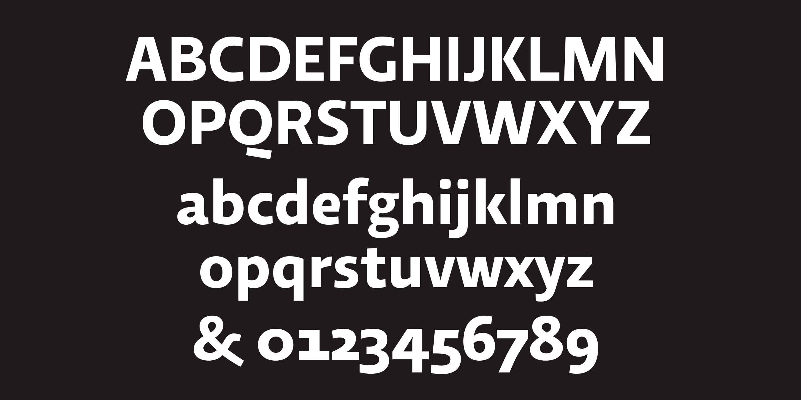
Glyphs
Glyphs
Relato Sans
Regular
- Relato Sans Light
- Relato Sans Light Italic
- Relato Sans Regular
- Relato Sans Regular Italic
- Relato Sans Medium
- Relato Sans Medium Italic
- Relato Sans SemiBold
- Relato Sans SemiBold Italic
- Relato Sans Bold
- Relato Sans Bold Italic
- Relato Sans Black
- Relato Sans Black Italic
ABCDEFGHIJKLMNOPQRSTUVWXYZ
abcdefghijklmnopqrstuvwxyz 0123456789
abcdefghijklmnopqrstuvwxyz 0123456789
ÀÁÂÃÄÅÆÇÈÉÊËÍÎÌÏIJŁÑ
ÒÓÔÕÖ،ފÙÚÛÜÝŸŽ
ÒÓÔÕÖ،ފÙÚÛÜÝŸŽ
àáâãäåæçðèéêëfiflfflíîìïijıłñ
òóôõöøœþšßsùúûüýÿž
òóôõöøœþšßsùúûüýÿž
0123456789 $£€¥ƒ¢%‰
&¡!¿?(/)[|]{\}‹«»›’”‘’“”‚„,;:.
†‡*§¶@©®™_- – —•·
¦^+−±×÷=≠#~≈<>≤≥ªº°
&¡!¿?(/)[|]{\}‹«»›’”‘’“”‚„,;:.
†‡*§¶@©®™_- – —•·
¦^+−±×÷=≠#~≈<>≤≥ªº°
*See the PDF for more details.