


Loading Fonts
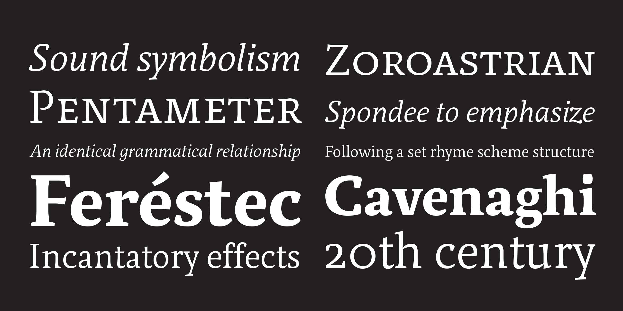
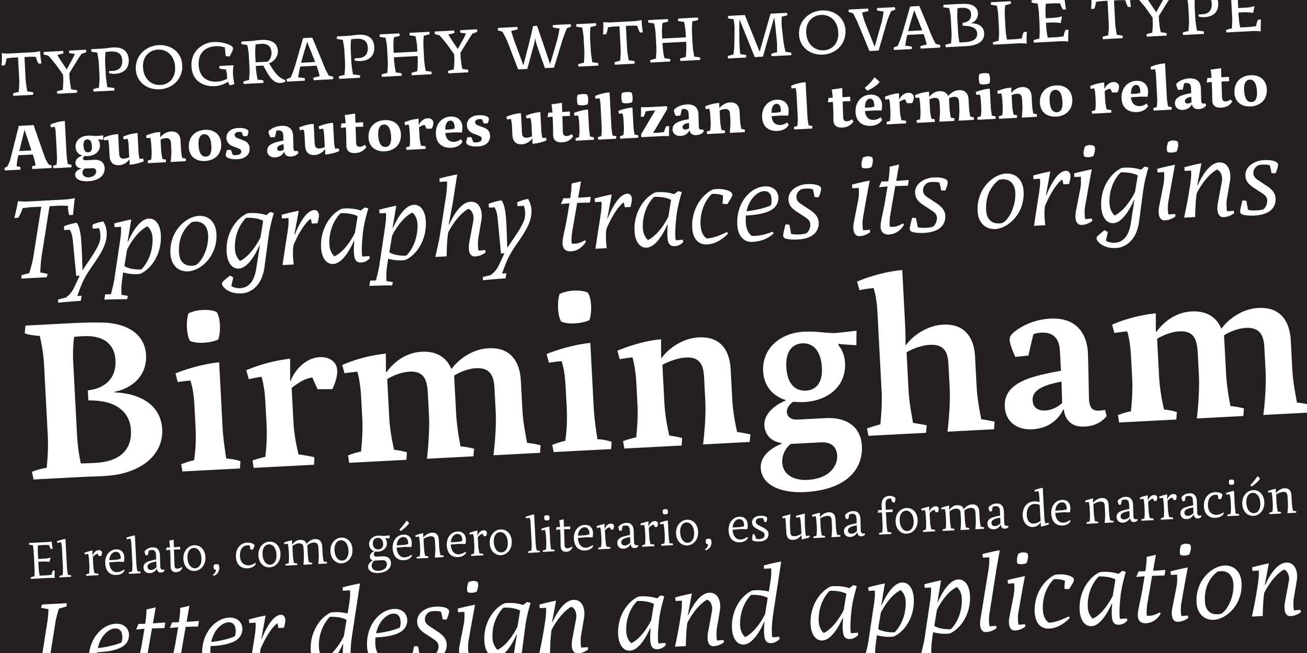
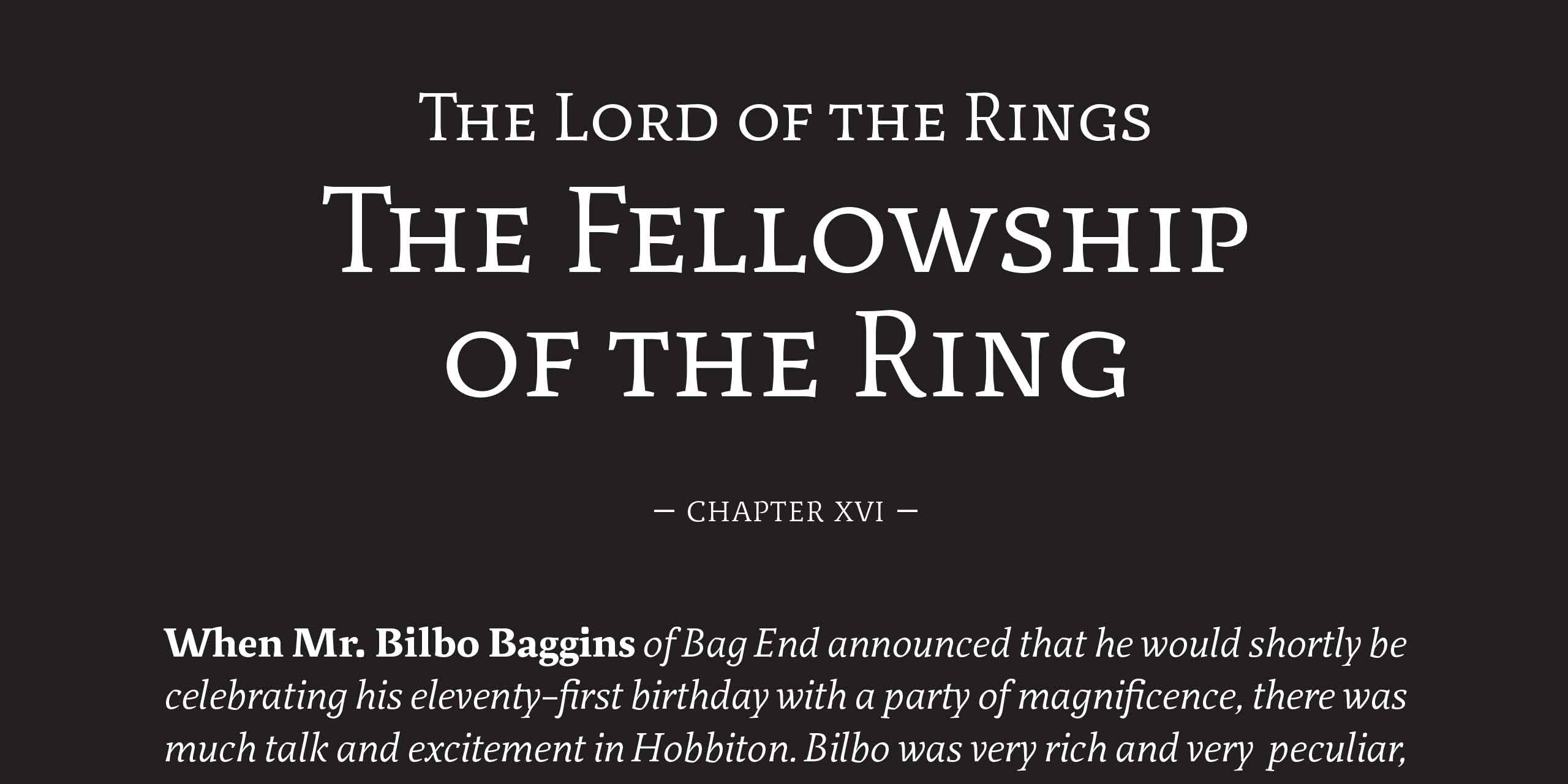
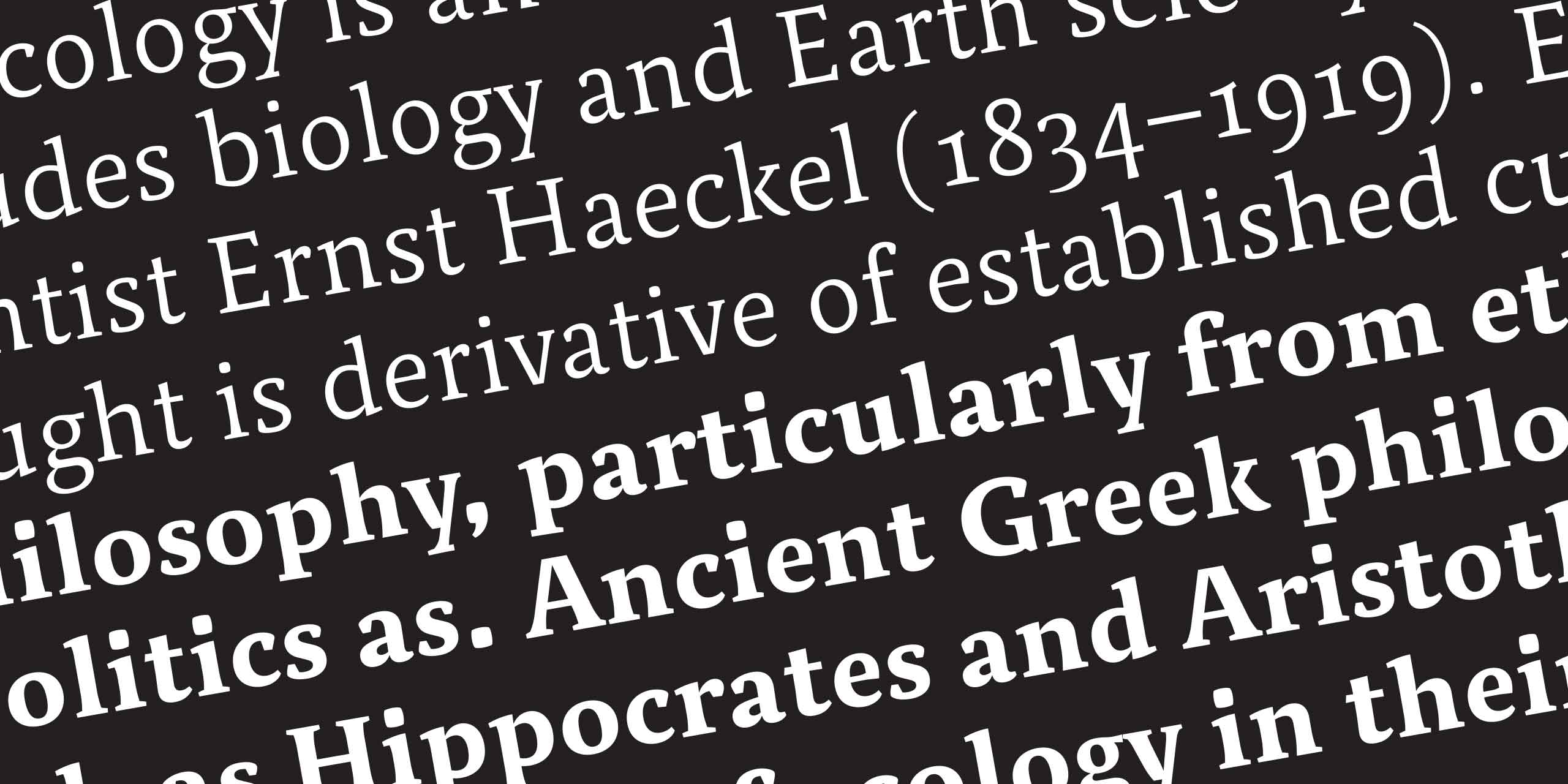
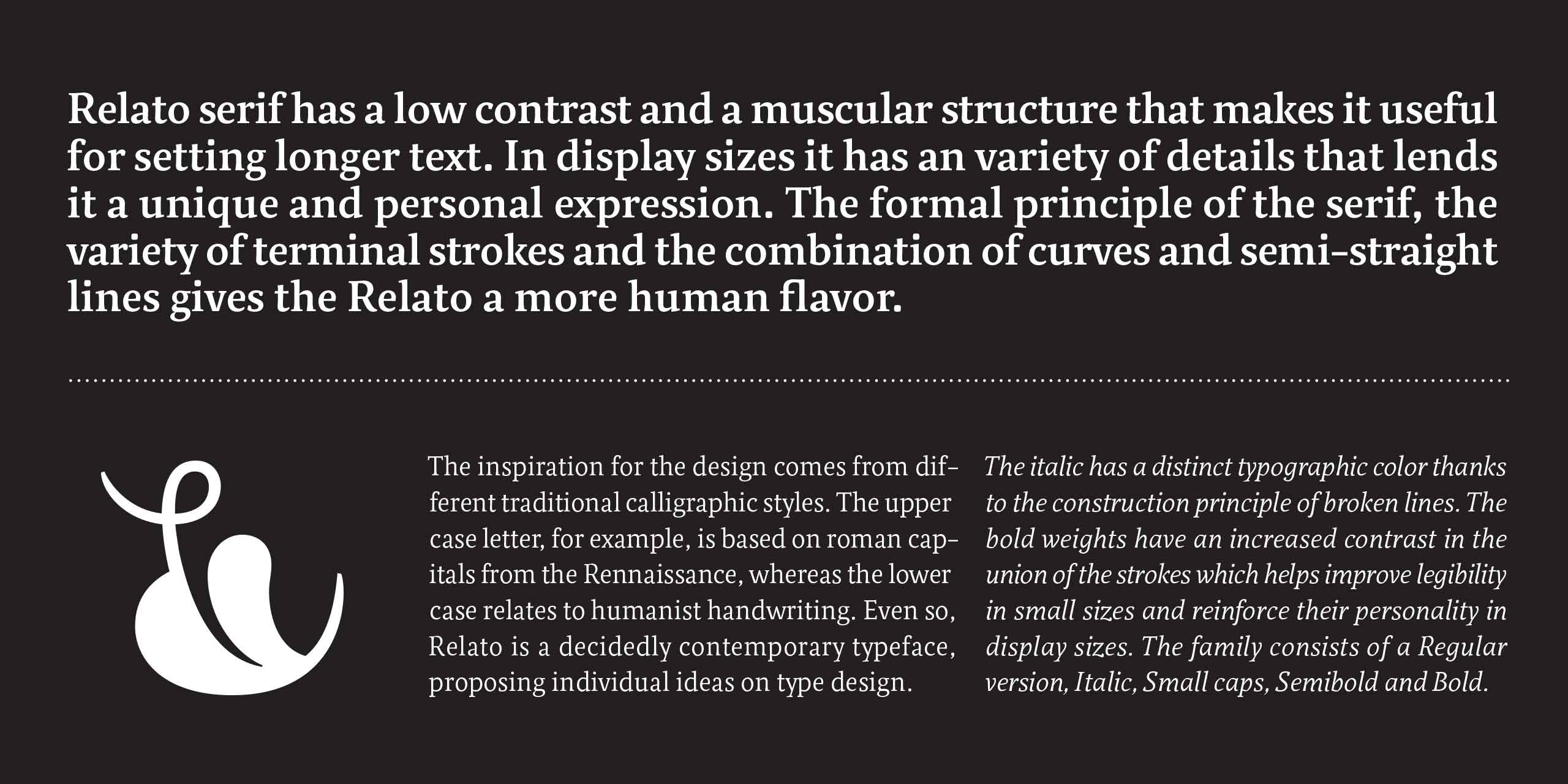
Relato Serif has a low contrast and a muscular structure that makes it useful for setting long text. In display sizes it has a variety of details that lends it a unique and personal expression. Its formal principles, the variety of terminal strokes and the combination of curves and semi-straight lines gives Relato a more human flavor. The inspiration comes from different traditional calligraphic styles. The upper case letter, is based on roman capitals from the Rennaissance, whereas the lower case relates to humanist handwriting. Even so, Relato is a decidedly contemporary serif typeface. Read more at the Blog.
- 5 Fonts
- Free trials
Relato Serif
Regular
- Relato Serif Regular
- Relato Serif Regular Italic
- Relato Serif Small Caps
- Relato Serif SemiBold
- Relato Serif Bold
Lithography
In a badly designed book, the letters mill and stand like starving horses in a field. In a book designed by rote, they sit like stale bread and mutton on the page. In a well-made book, where designer, compositor and printer have all done their jobs, no matter how many thousands of lines and pages, the letters are alive. They dance in their seats. Sometimes they rise and dance in the margins and aisles. — Robert Bringhurst, The Elements of Typographic Style.
Relato Serif
Regular Italic
- Relato Serif Regular
- Relato Serif Regular Italic
- Relato Serif Small Caps
- Relato Serif SemiBold
- Relato Serif Bold
Virtual poems
In a badly designed book, the letters mill and stand like starving horses in a field. In a book designed by rote, they sit like stale bread and mutton on the page. In a well-made book, where designer, compositor and printer have all done their jobs, no matter how many thousands of lines and pages, the letters are alive. They dance in their seats. Sometimes they rise and dance in the margins and aisles. — Robert Bringhurst, The Elements of Typographic Style.
Relato Serif
Small Caps
- Relato Serif Regular
- Relato Serif Regular Italic
- Relato Serif Small Caps
- Relato Serif SemiBold
- Relato Serif Bold
Intruder
In a badly designed book, the letters mill and stand like starving horses in a field. In a book designed by rote, they sit like stale bread and mutton on the page. In a well-made book, where designer, compositor and printer have all done their jobs, no matter how many thousands of lines and pages, the letters are alive. They dance in their seats. Sometimes they rise and dance in the margins and aisles. — Robert Bringhurst, The Elements of Typographic Style.
Relato Serif
SemiBold
- Relato Serif Regular
- Relato Serif Regular Italic
- Relato Serif Small Caps
- Relato Serif SemiBold
- Relato Serif Bold
Romanticism
In a badly designed book, the letters mill and stand like starving horses in a field. In a book designed by rote, they sit like stale bread and mutton on the page. In a well-made book, where designer, compositor and printer have all done their jobs, no matter how many thousands of lines and pages, the letters are alive. They dance in their seats. Sometimes they rise and dance in the margins and aisles. — Robert Bringhurst, The Elements of Typographic Style.
Relato Serif
Bold
- Relato Serif Regular
- Relato Serif Regular Italic
- Relato Serif Small Caps
- Relato Serif SemiBold
- Relato Serif Bold
Madame Bovary
In a badly designed book, the letters mill and stand like starving horses in a field. In a book designed by rote, they sit like stale bread and mutton on the page. In a well-made book, where designer, compositor and printer have all done their jobs, no matter how many thousands of lines and pages, the letters are alive. They dance in their seats. Sometimes they rise and dance in the margins and aisles. — Robert Bringhurst, The Elements of Typographic Style.
Glyphs
Glyphs
Relato Serif
Regular
- Relato Serif Regular
- Relato Serif Regular Italic
- Relato Serif Small Caps
- Relato Serif SemiBold
- Relato Serif Bold
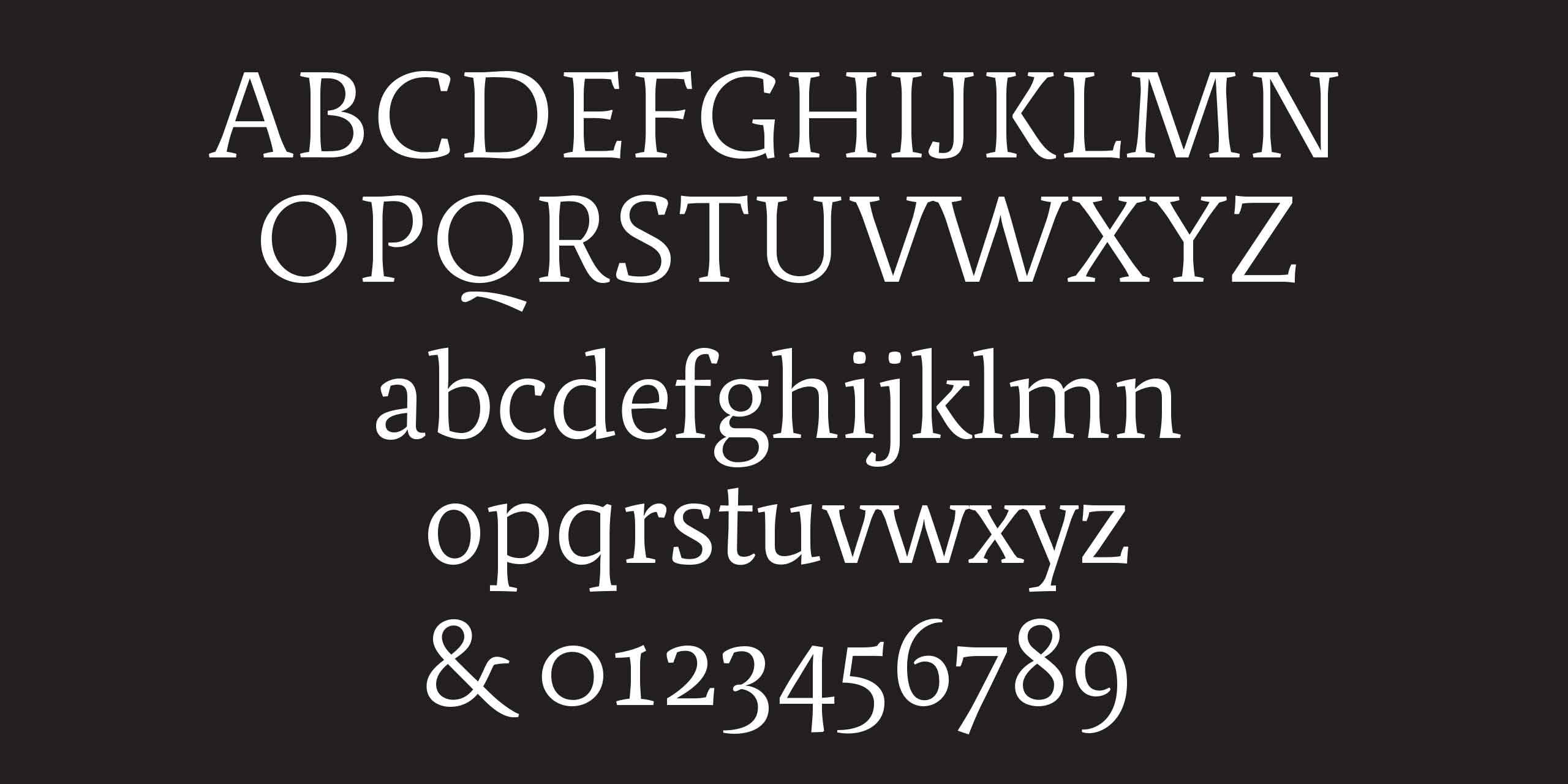
ABCDEFGHIJKLMNOPQRSTUVWXYZ
abcdefghijklmnopqrstuvwxyz
0123456789
abcdefghijklmnopqrstuvwxyz
0123456789
ÀÁÂÃÄĀĂÅĄÆĆĈČĊÇĎĐÈÉÊĚËĒĔĖĘ
ĜĞĠĢĤĦÍÎÌĨÏĪİĮIJĴĶĹĽĻĿŁŃŇÑŅÒÓÔÕ
ÖŌŎŐØŒÞŔŘŖŚŜŠŞȘŤŢŦÙÚÛŨÜŪŬ
ŮŰŲẀẂŴẄÝŶŸŹŽŻ
ĜĞĠĢĤĦÍÎÌĨÏĪİĮIJĴĶĹĽĻĿŁŃŇÑŅÒÓÔÕ
ÖŌŎŐØŒÞŔŘŖŚŜŠŞȘŤŢŦÙÚÛŨÜŪŬ
ŮŰŲẀẂŴẄÝŶŸŹŽŻ
àáâãäāăåąæćĉčċçðďđèéêěëēĕėę
fffiffiflfflĝğġģĥħíîìĩïīįijıȷĵķĸĺľļŀłńňñņʼn
òóôõöōŏőøœþŕŗřśŝšşșßsťţŧùúûũü
ūŭůűųẁẃŵẅýŷÿźžż
fffiffiflfflĝğġģĥħíîìĩïīįijıȷĵķĸĺľļŀłńňñņʼn
òóôõöōŏőøœþŕŗřśŝšşșßsťţŧùúûũü
ūŭůűųẁẃŵẅýŷÿźžż
&¡!¿?(/)[|]{\}‹«»›’”‘’“”‚„,;:._-–—•·
0123456789†‡*§¶@©®™€$¢£ƒ¥
¦^+−±×÷=≠#~≈<>≤≥%‰ªº°
⁰¹²³⁴⁵⁶⁷⁸⁹ ₀₁₂₃₄₅₆₇₈₉
⅓ ⅔ ⅕ ⅖ ⅗ ⅘ ⅙ ⅚ ⅛ ⅜ ⅝ ⅞
0123456789†‡*§¶@©®™€$¢£ƒ¥
¦^+−±×÷=≠#~≈<>≤≥%‰ªº°
⁰¹²³⁴⁵⁶⁷⁸⁹ ₀₁₂₃₄₅₆₇₈₉
⅓ ⅔ ⅕ ⅖ ⅗ ⅘ ⅙ ⅚ ⅛ ⅜ ⅝ ⅞
*See the PDF for more details.