Close Menu
Fonts
Geogrotesque Mono
Geogrotesque
Steradian
Approach
Decagram
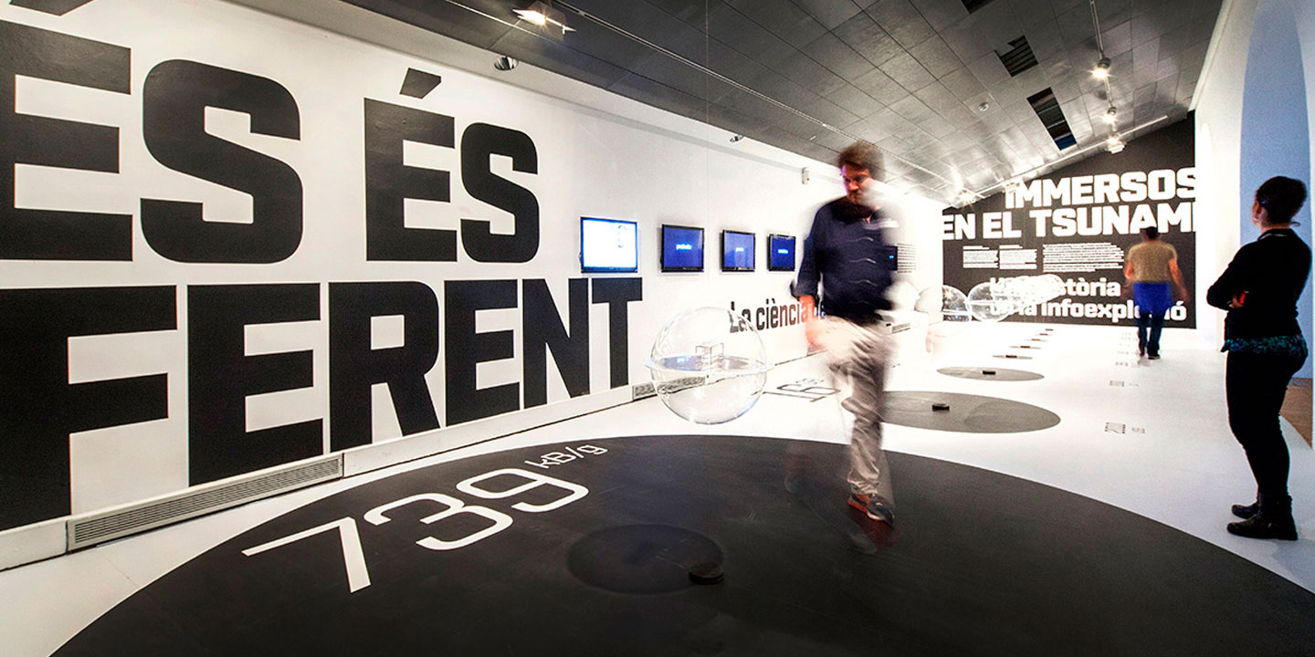
Aribau Grotesk
Ciutadella
Geogrotesque Sharp
Ciutadella Rounded
Akkordeon
Shentox
Camber
Majorant
Aribau Rounded
Goalking
Inklination
Approach Mono
Periódico
Realgar
Akkordeon Slab
Classike
Chiaroscura
Geogrotesque Exp
Geogrotesque Condensed Series
Geogrotesque Slab
Geogrotesque Stencil
Geogrotesque Cyr
Isotonic
Ciutadella Display
Ciutadella Slab
Relato Serif
Relato Sans
Dixplay
Custom
Blog
About
Free trials
Log In
Sign In
Cart
Email
Password
Forgot your password?
Fonts
Custom
Blog
About
Free trials
Log In
Cart
0
Cart
0
Emtype Foundry
new
Geogrotesque Mono
Geogrotesque
Steradian
Approach
exclusive
Decagram
Aribau Grotesk
Ciutadella
Geogrotesque Sharp
Ciutadella Rounded
Akkordeon
Shentox
Camber
Majorant
exclusive
Aribau Rounded
exclusive
Goalking
50% limited time
Inklination
Approach Mono
Periódico
Realgar
Akkordeon Slab
Classike
Chiaroscura
Geogrotesque Exp
Geogrotesque Condensed Series
Geogrotesque Slab
Geogrotesque Stencil
exclusive
Geogrotesque Cyr
Isotonic
Ciutadella Display
Ciutadella Slab
Relato Serif
Relato Sans
Dixplay
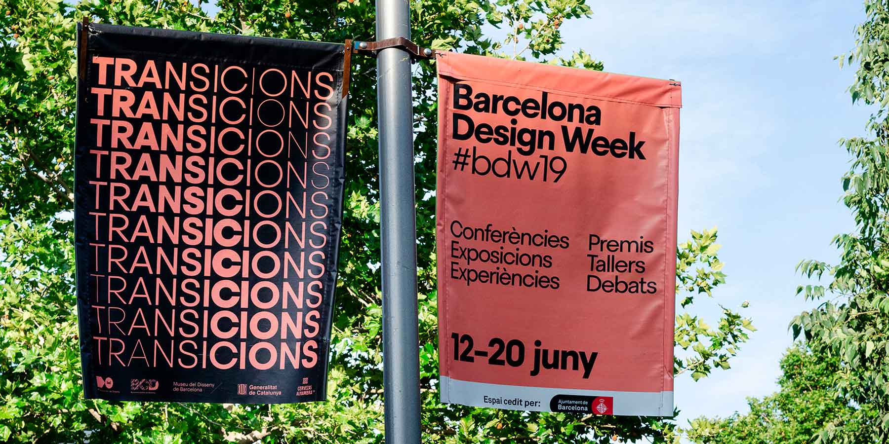
Qantas Airways
Malquerida
La Pedrera
Real Betis
Atelier de Sèvres
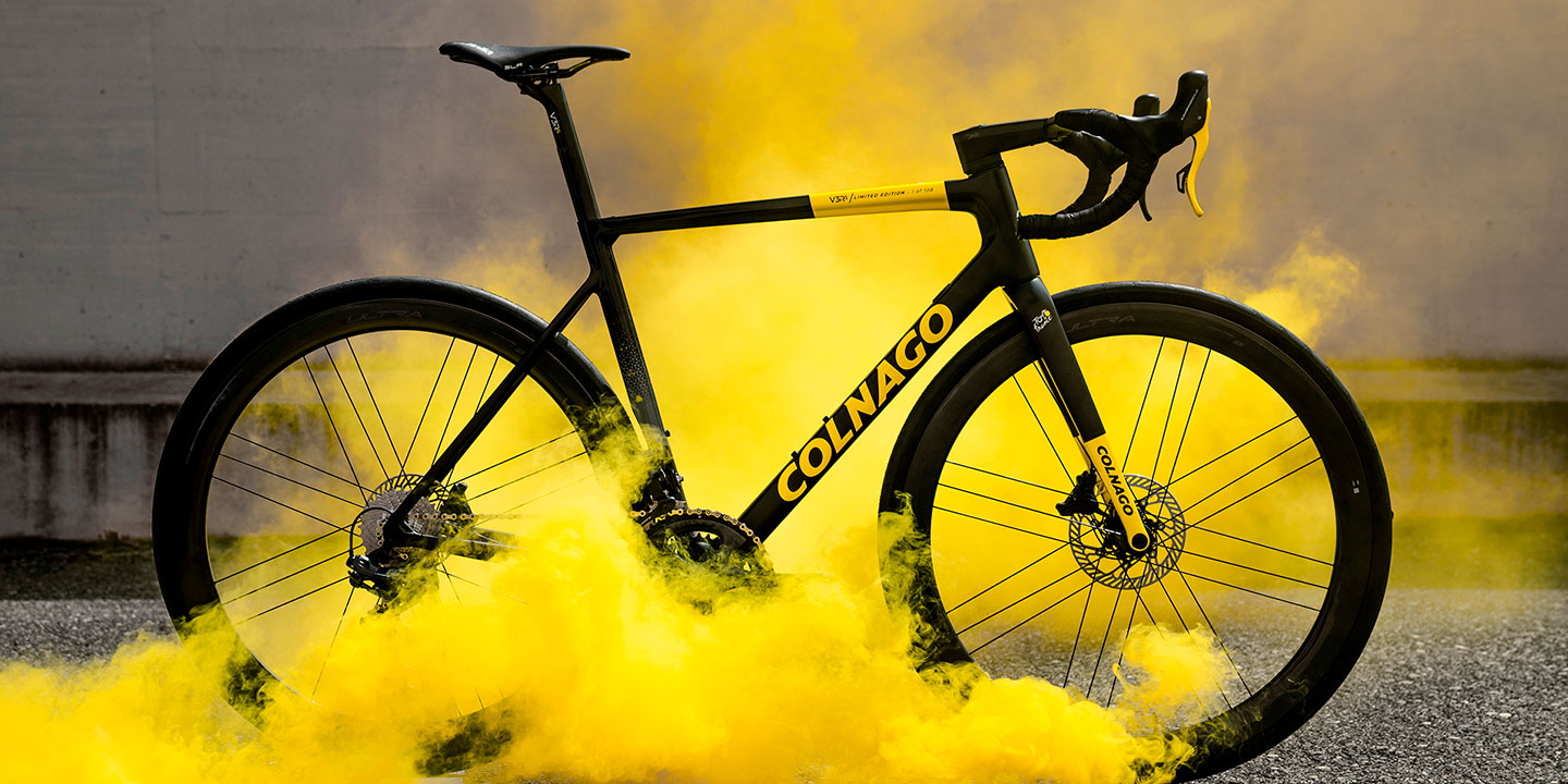
Colnago
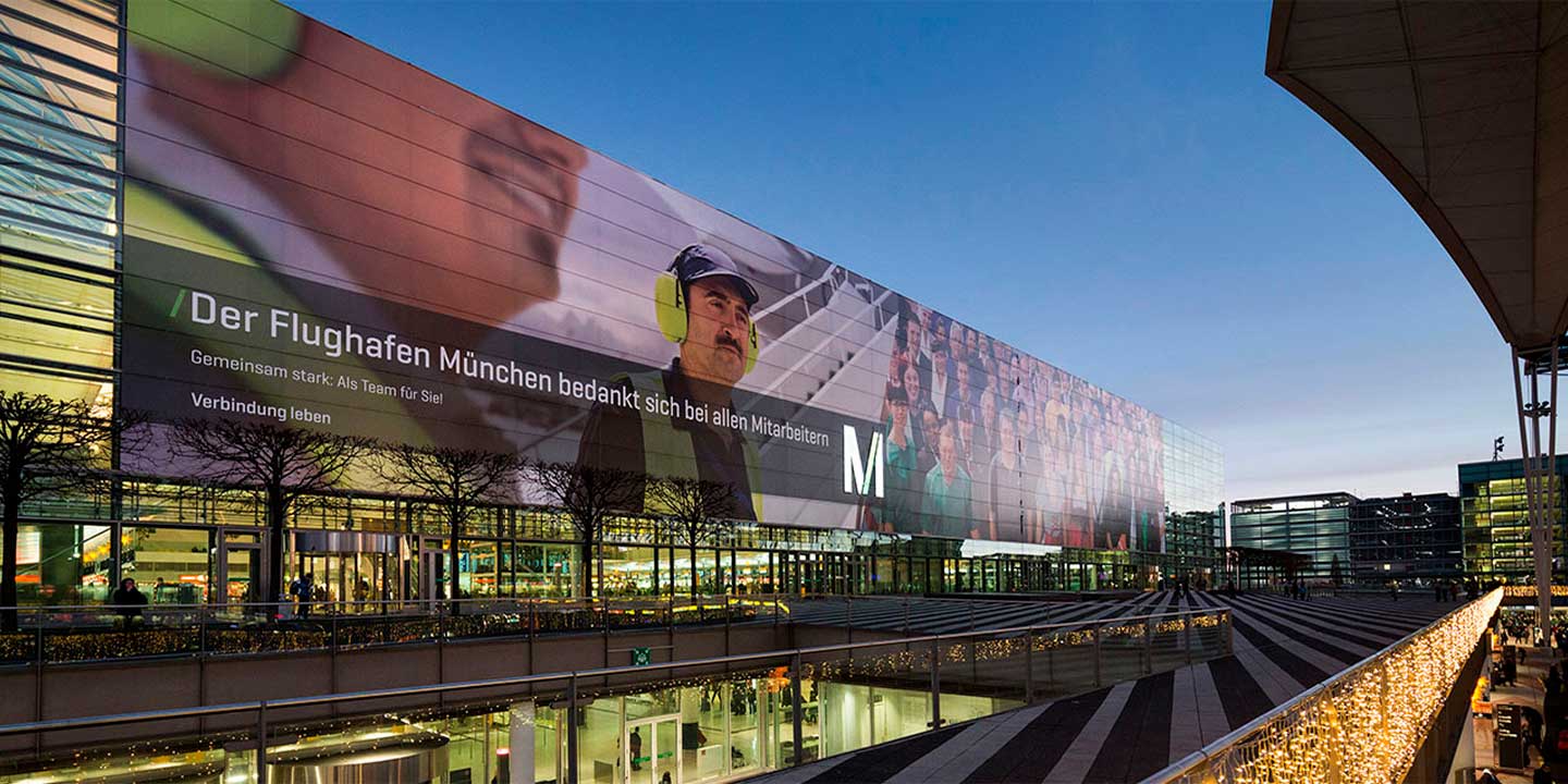
Munich Airport
Fate
Stadt Köln
Catalana Occidente
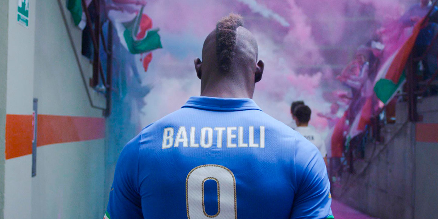
Puma Football
ESPN Magazine
Il Messaggero
Marítim Bar
Big Bang Data
T.End
Vaya Tipo!
ABC Newspaper
EVE Echoes
Castelldefels
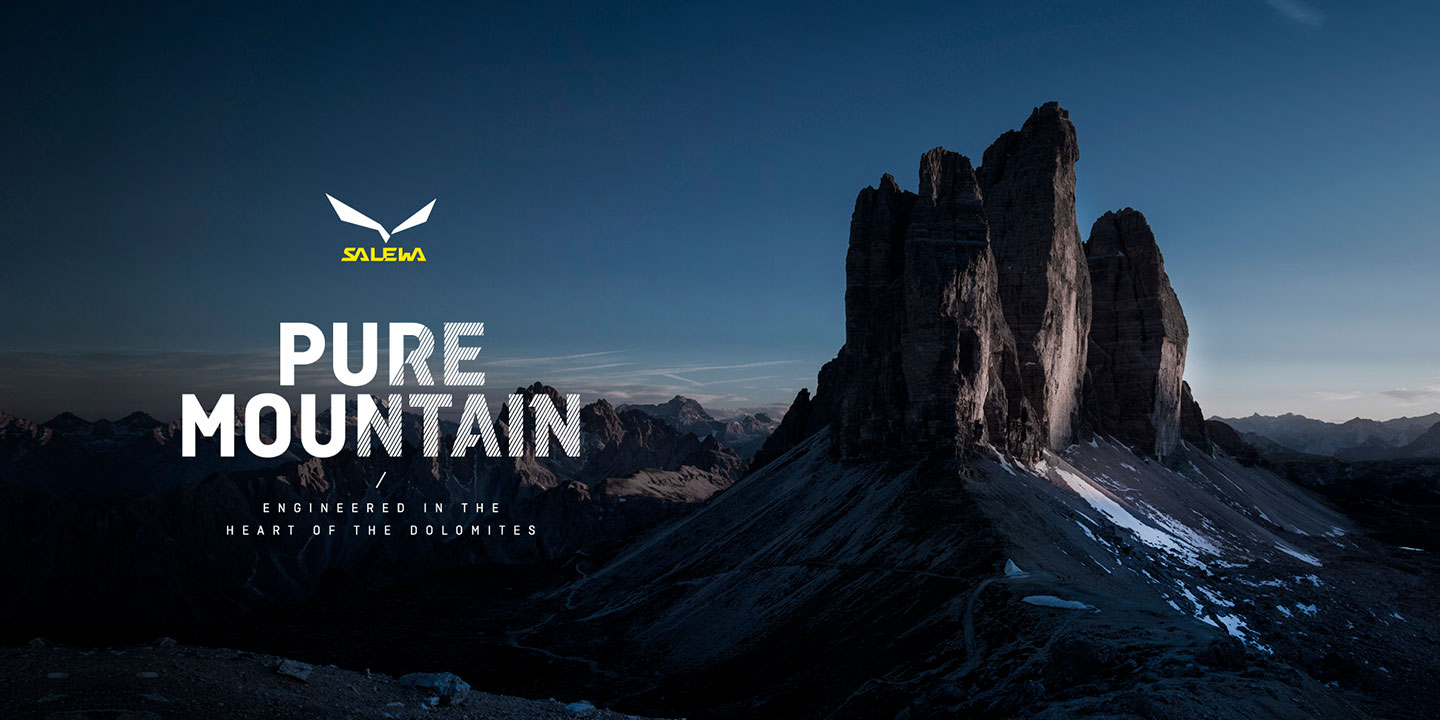
Salewa
The Sunday Times
History & Downloads
Account settings
Logout
Email
Password
The email or password is incorrect
Forgot your password?
New client
Monospaced
Geogrotesque Mono — New & Exclusive!
Geogrotesque
14 Styles — Best Seller!
Steradian
16 Styles
Approach
16 Styles
Decagram
20 Styles + Variable Font — Exclusive!
Aribau Grotesk
16 Styles
Ciutadella
10 Styles
Geogrotesque Sharp
7 Widths — 98 Styles + Variable Font
Ciutadella Rounded
10 Styles
Akkordeon
14 Styles
Shentox
14 Styles
Camber
14 Styles
Majorant
16 Styles
Aribau Rounded
16 Styles + Variable Font — Exclusive!
Goalking
16 Styles + Variable Font — Exclusive!
Inklination
50% off until April 30
Monospace
Approach Mono — 6 Styles
Periódico
30 Styles — Text & Display
Realgar
12 Styles + Variable Font
Akkordeon Slab
14 Styles
Classike
12 Styles + Variable Font
Chiaroscura
14 Styles + Variable Font
Expanded
Geogrotesque Expanded Series — 3 Widths / 42 Styles
Condensed
Geogrotesque Condensed Series — 3 Widths / 42 Styles
Slab serif
14 Styles
Stencilling
Geogrotesque Stencil — 3 Cuts / 42 Styles
Kириллица
Geogrotesque Cyrillic — 14 Styles
Isotonic
10 Styles
Ciutadella Display
12 Styles
Ciutadella Slab
10 Styles
Relato Serif
5 Styles
Relato Sans
12 Styles
Dixplay
2 Styles
Cookies preferences
Required cookies
Strictly essential to ensure the correct functioning of the website.
Analytical cookies
Allow us to know how users interact with the website and to improve its performance.
Save preferences
Cookies
We use cookies to improve your experience on this site. By continuing to browse our site you agree to our use of cookies.
Manage cookies
Accept cookies